Well Revolution
Role:
User Experience Designer
Responsibilities:
-
User Interviews
-
Research
-
Visual & Interaction Designs
-
Prototyping
-
Usability Testing
Outcome:
Seamless onboarding experience for doctor & patient connection

Overview
Well Revolution is a New Zealand-based company that develops a mobile app for online consultation with a doctor. The app enables users to message or video call a doctor to get diagnosed and have prescription medication delivered to their home or nearest pharmacy.
Problem Statement
The company noticed its low retention rate and discovered flaws in the registration process. The registration was taking a long time and users weren't informed effectively. My role was to improve the sign-up process and let patients connect with a doctor seamlessly.
Process

Usability Issues
What were former users saying?
The process took a long time with questions and the doctor asked me the same questions. So why waste time?
I didn't know they weren't covering mental health. It was a waste of time and money.
It was impossible to know how long I was expected to wait to talk to a doctor.
Competitive Analysis
My research was on 4 apps - MDLive, Plush Care, Live Health, and Dr.OnDemand. They all had the following points in common:
• Consultation began in less than 15 minutes
• High range of doctors
• Extensive care for patients via video chat and text messaging
• Reliable medical record history
• Easy to use and provided all facilities on a single platform
User Interviews
I found some volunteers for interviews including 3 doctors and 7 patients. Participants had recent telemedicine experience.
Sometimes doctors asked the questions that the app already asked. It made me feel uncomfortable.
It was frustrating to know how much I'd be paying after going through tons of questions before speaking to a doctor.
After the consultation, I got a referral because the app wasn't treating that particular illness. It was a waste of time and money.
It would be nice to know how soon I could talk to a doctor.


Usability Testing
-
6/10 users found the onboarding very long
-
5/10 users thought some questions like fever, and pain rate could be eliminated since the doctors would be asking these questions anyway
-
4/10 users mentioned the sign-up could be easier
Solution
-
Sign in & Up: We implemented three ways to sign in & up - by email address, face time recognition, and Google account


Solution
-
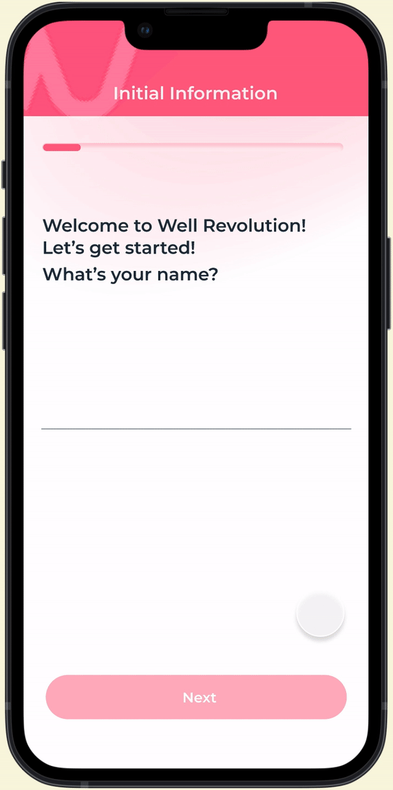
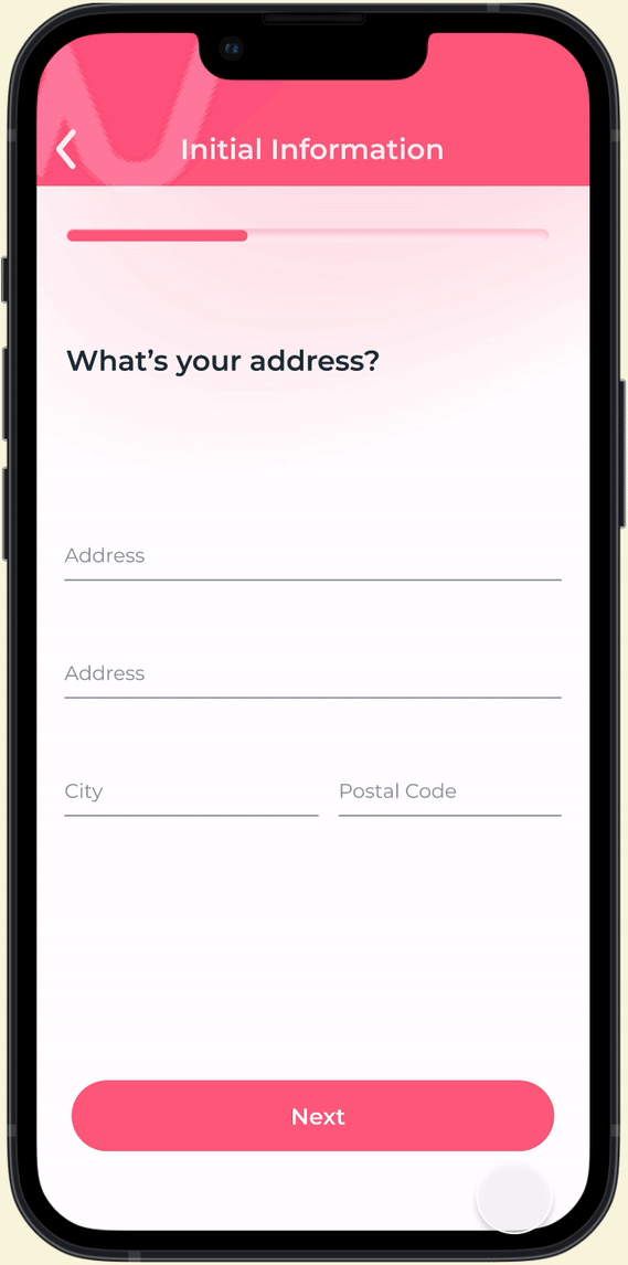
Onboarding - Required Questions: We reduced the amount of to a minimum. Required questions were Name, DOB, Gender, and CC.

Solution
-
Onboarding - Optional Questions: We agreed to keep some questions optional in case users wish to answer but they can easily skip as Height, Allergies, and Medications.
Solution
-
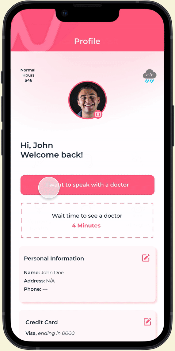
Profile: Profile section was editable anytime and one click away that included the Consultation price for the hour, We added weather information and the waiting time for a doctor.
Solution
-
Consultation: Registered users could speak to a doctor in 3 steps. I designed the waiting room for the sake of the testing, otherwise, it's handled by a third party. There were some concerns regarding the CTA buttons' font colors, but it was in the company's design system.
Usability Testing
I conducted usability test to ensure my assumptions aligned with the earlier feedback. The design had 4 iterations. I rectified some errors, simplified the design, and had some ideas for the next iteration.
Final Thoughts
Well Revolution gave me an opportunity to learn more about the Telemedicine industry.
It was valuable to me as telemedicine apps are booming. I hoped to give Well Revolution users simple, user-friendly, and efficient experiences with minimal screens, and a clean user interface design.
User feedback definitely served to the development of the project.
This is not a final work as the industry develops, I will continue to iterate and update the design.
Thank you!

